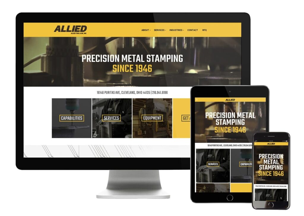
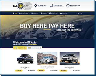
We design every Launch Kit around your brand’s voice, values, and audience. It’s not a cookie-cutter template — it’s your digital storefront, crafted to convert.
Real Infrastructure. Not Just a Website.
Keystone partners with EZTOUSE.com — a trusted name in local business technology — to deliver every Launch Kit. That means your site isn’t just launched quickly, it’s powered by real infrastructure: built-in forms, CRM, payments, analytics, and local search listings via Google & Bing.
Built to Grow With You.
This isn’t a set-it-and-forget-it website — it’s your growth foundation. Add content, pages, email touchpoints, or marketing tools as you scale. And if you need help, we’re there so you’re never stuck when it matters most.
More Than Just a Website
What’s Included in Every Launch Kit
Your Launch Kit isn’t just a website — it’s a complete digital foundation, designed to help you capture leads, convert customers, and grow without tech headaches. Here’s what you get with every package:
Professionally Designed Website
A sleek, mobile-ready site built to convert — tailored to your brand and goals.
Domain Name Included
We secure your .com, .org, or .net so your brand is ready to launch with confidence.
Google & Bing Business Profile Setup
Boost your local visibility with expert setup of your search listings.
Contact + Funnel Form
Turn visitors into leads with a smart form built for quotes, appointments, or signups.
Fast & Secure Website Hosting
Reliable, business-grade WordPress hosting with backups and SSL included.
Analytics & SEO Tools
Stay in control with Google/Bing analytics, SEO indexing, and performance tracking.
Questions? Comparisons? Tech worries?
Get Clarify Before You Commit.
Not quite ready to start your Launch Kit? No pressure — we’re here to chat, answer questions, or help you figure out the best fit for your business. You can reach out by email, phone, text — or use the little chat bubble in the corner to talk to a real human.
Use the form below or message us directly — we’re here whenever you’re ready.
